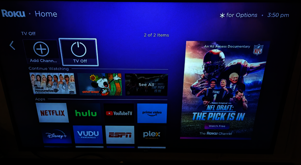
As HDTVTest reported a couple of weeks ago, Roku is making some key changes to its underlying TV operating system. It has reportedly now begun rolling out the updated version of its Home Screen to many more users than the initial batch of early testers.

The new Home Screen looks a lot more like Google TV with a 4x4 app row, a new “continue watching” row above, and various folders plus ads. In addition, Roku will now refer to apps as actual “Apps”, as opposed to “Channels”.
CordCutters News reports that the updated interface is rolling out to thousands of Roku TV users who have purchased one of the company’s high-end media streaming sticks, and says it could soon be made available to every Roku user.
The biggest change is that instead of a three-by-three app row, we now have four-by-four, so there are 16 tiles instead of nine visible. The new Continue Watching row enables viewers to pick up from where they left off and displays up to three shows or movies left unfinished, with users able to scroll through to view others. There’s also a new What To Watch section that provides recommended content, though users will have to scroll down through the Home Screen to see this.
Roku’s move to a larger app drawer adds convenience and also makes sense at a time when many consumers are investing in larger-sized TVs.
In addition, the update also reorganizes inputs on Roku TV. All HDMI ports can now be accessed from the same folder, while Roku’s decision to embrace “Apps” may mean a little less confusion for those who are moving to the platform from something like Google TV or Tizen, where apps are indeed apps.
The Roku TV operating system was last updated in April, so the new Home Screen may be part of a broader rollout of new functionality coming soon. Typically, Roku launches new hardware in the autumn, so it’s likely that whatever new devices it introduces then will come with the updated version of its platform.